
Winning a customer’s heart through the Love-U-u-UX shopping cart
Winning a customer’s heart through the Love-U-u-UX shopping cart
The more shopping opportunities pop up, the harder it is to win the hearts of shoppers because their expectations are higher than ever.
How can you not only satisfy these expectations but surpass them? Here is a “simple” answer to this dilemma
to create an EXTRAordinary experience for the client
- Always put yourself in the customers’ shoes to meet their needs and to be on the same page with them. Make your customers feel truly valued and special – make them literally fall in love with your business.
It is important to avoid pseudocaring, that is, unfortunately, the case for many brands. It’s a common thing to hear the following: “We are not responsible for the quality of the goods you purchased at our shop, we are just sellers – make your claim to manufacturer”, “The goods you ordered are out of stock, but they are still available on the website because our content manager has not removed it yet” or ” Your call is very important to us, but all of our agents are busy at this time. Please, call us later. Bye-bye! “
Does that sound familiar? We can go on and on with such examples.
- Build on personalized customer relationships (one-to-one relationships) – this is a must-have rather than option, put aside common patterns – be on the same page and literally in the right place and at the right time, when it is convenient to a particular client, not to you:
“Our courier is already at your place, having arrived one hour before the confirmed delivery time, but he can’t wait for you” or the courier arrives without a notification call 30 minutes before delivery. Sorry, but this is a «mauvais ton.»
- Exceed customer expectations: go one click and one second ahead, be relevant, and be sure to surprise.
For example, “Your parcel has already arrived at our depot and will be stored for free during the quarantine period – you’re welcome to pick it up when it’s convenient for you.”
And it works, because 86% of customers, a fantastic number, would pay MORE for a better experience
- When it comes to online stores, the way your customers interacting with the shopping cart should be your primary focus on, as it is a footstep away from completing the purchase. And this part of the client’s experience should be perfect, at least normal.
- Customers, viewing your products, may be at different stages of the sales funnel, so that they may be ready to make a purchase or review and gather information to make the right decision.
- But one thing is for sure: they can leave your site within seconds after a disappointing experience.
- Getting a superior shopping cart experience is an epic challenge. This is one of the most sensitive stages in the process of making a purchase, and therefore most e-commerce makes numerous mistakes, such as making their users register and go a longer way to checkout processes.
- Did you know that the percentage of abandoned shopping carts is about 50% and 80%, according to a ReadyCloud report? These percentages demonstrate that more than half of sales are lost in this final step. Hardly surprising, then, companies invest millions in bringing a better shopping cart experience to their customers.
- Apple, Bellroy, Wallmart, Etsy, Amazon, Toys « R « Us, and Zappos are some of the e-commerce who perfect themselves in the art of creating an optimal shopping cart experience. Their success is not only due to having an amazing product or service, but to their strategies to reduce shopping cart abandonment.
The purpose of this post is to spotlight some of the key guidelines when it comes to creating a shopping cart for amazing customer experience, along with examples from various e-commerce to help you get inspired to adopt them.
[icon name = “arrows-alt”] SHOPPING CART’S “FOLLOWING THE CUSTOMER”
It is important to keep this element visible, just following the user on your website. It is recommended to put it in a blank header, in the top right on the website (next to the “sign-in” button), and in the mobile application bottom bar.
One of the reasons to do it this way is access to the checkout page where the purchase is completed.
[icon name = “info-circle”] SHOPPING CART INFORMS THE CUTOMER
The shopping cart icon is not just a design element. It performs an important informative function as it allows the user to see not only the number of items added to the cart but their price and their total cost. It’s enough to hover over the cart on the desktop or tap on the smartphone to obtain this information.
Furthermore, it is recommended to notify the shopper when an item is placed in the cart. It is not necessary to make confirmation. Instead, add a visual effect that lets the user know that the item is already in the cart.
[icon name = “hourglass-half”] FEWER STEPS TO COMPLETE THE PURCHASE
There are two forms of a shopping cart page design:
1) “pop-up” or “one-page” when all the information (payment methods, items, and their cost, shipping, and delivery, etc.) is displayed on a single page in a plain and orderly manner so that the user can cover it at a glance.
This cart has already become a trend because the number of clicks to place an order is minimal. Its key function is to confirm the action for the client. This is a good option for online fashion outlets, as well as for online stores with a small range of products.
2) “step-by-step”, when the above information is no placed on a single page, but distributed on several pages and shown step-by-step, as the completes the purchase. This option works best for a hypermarket with a wide range of items.
[icon name = “grin-hearts”] LOYALTY IN DETAILS – 100%
- The user can buy several items at once, so it is necessary to give the opportunity to check the order before completing the purchase (remove or add one or multiple items to the cart or click Save for Later to postpone the purchase of some items and add them to favorites, making it easy to keep a wish list for future purchases.)
- It is also desirable to display in the cart those items that are out of stock or have run out while the user was collecting the order, and dynamically change a shopping cart total.
- When the product is expensive, the purchase usually cannot be completed in one click, therefore each page of the cart should contain as much information as possible, so as not to make the buyer take a step back.
- Do not force the customer to re-fill in the same information, such as entering a separate billing address and shipping address if they are the same.
- More than half of customers say that filling in the same information several times is most annoying and frustrating throughout the purchase process.
- Simply let the user enter a shipping address, having a checkbox “Billing address same as shipping”.
No matter which of the shopping cart page design you use, the main thing is to minimize the number of clicks and elements that can make the purchase process more complicated.
Best e-commerce practices to get inspired
Simple but beautiful design + great functionality, in the particular innovative shopping cart.
- When adding a product, a window opens, which displays the entire basket: with information about delivery, the ability to enter a promo code, edit the product and the total cost, including taxes and shipping.
- The button leading to the checkout page reduces the number of clicks to complete the purchase.
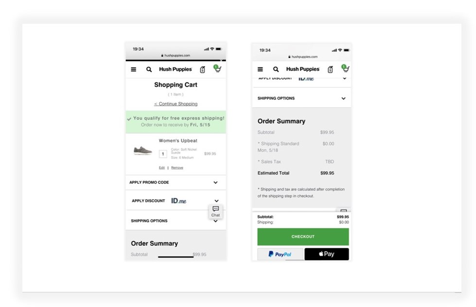
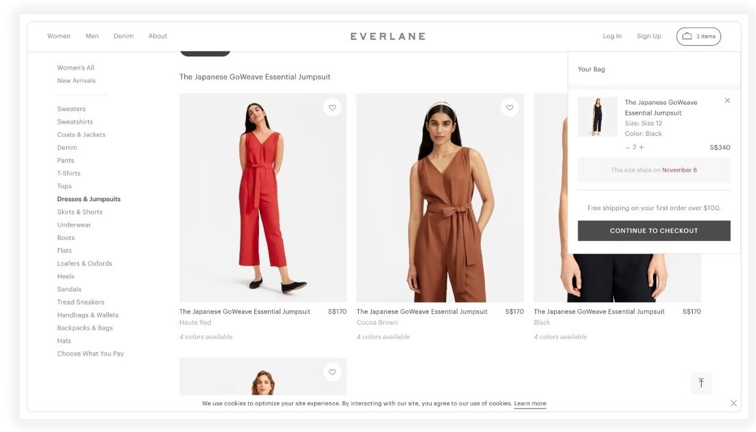
A good example is Everlane with their mini-cart informing the user about the shipping date.
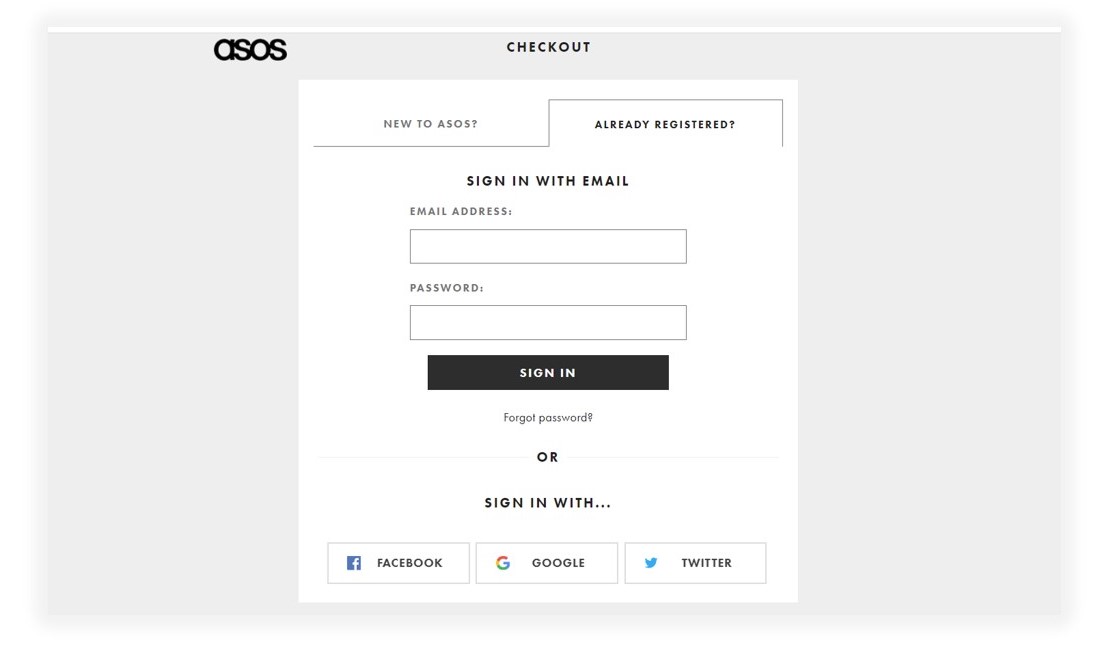
- Reduced their cart abandonment rate, having persuaded checkout 50% new customers through a guest checkout process.
- Users are also welcomed to sign in with their Facebook, Google, or Twitter accounts.
“We didn’t fundamentally change any functionality or page flows at this point. One thing we did change was the login screen after lengthy split testing; the changes resulted in a 50% decrease in the abandonment of the site at this page,” ASOS E-commerce Director James Hart.
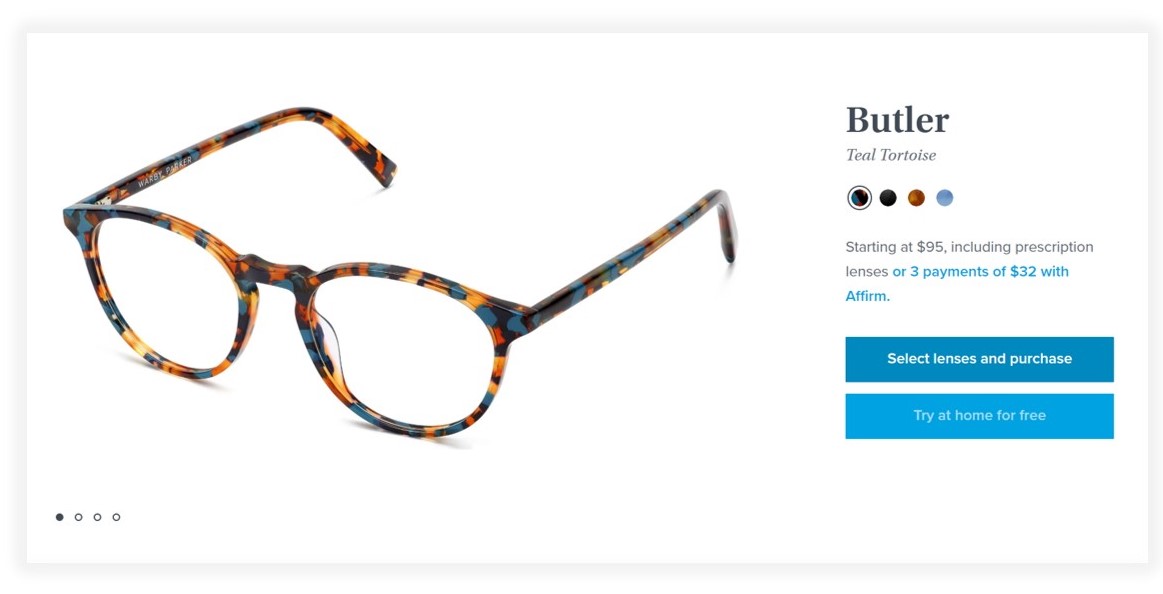
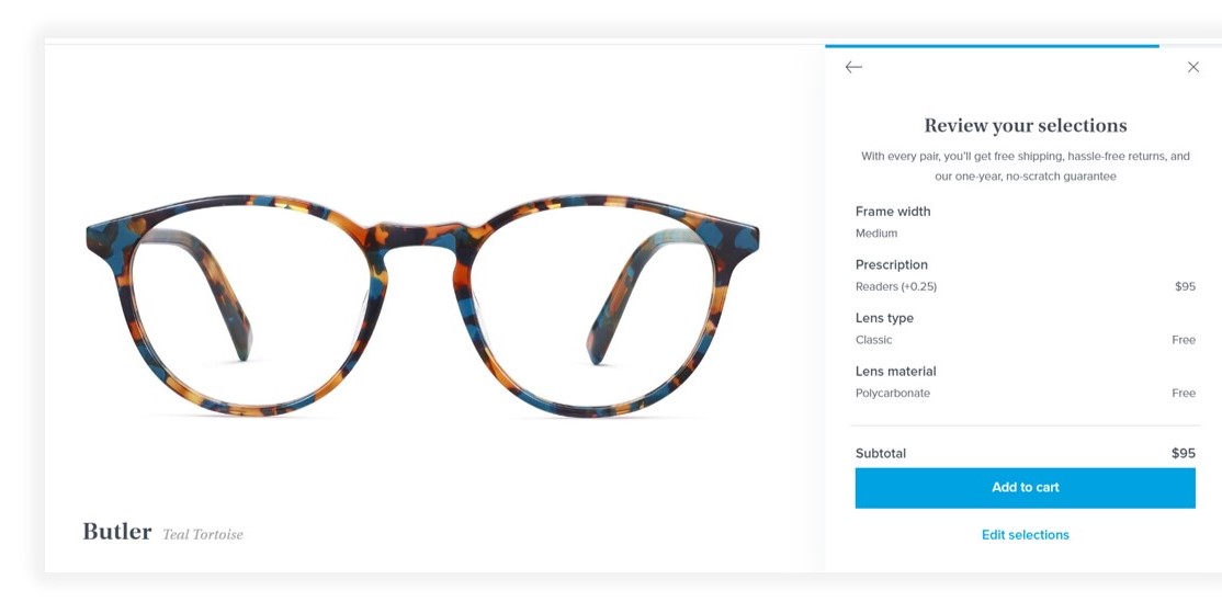
On their shopping cart page, Warby Parker in a stunningly plain and easy manner communicates with their customers. They can review the order and simply adjust it at any step. This helps to decrease the percentage of users abandoning their cart due to unclear information.
There are also a couple of pretty lovely features that so much contribute to great customer experience like:
- how they display a decent-size product image which would also improve the experience for mobile users; instead of using just a small thumbnail
- they offer to try glasses at home with the call-to-action button at the beginning of the checkout process
- they show clear-cut concise shipping, return and guarantee rules just in a checkout box instead of forcing the customers to read their long policies and go to the FAQ page
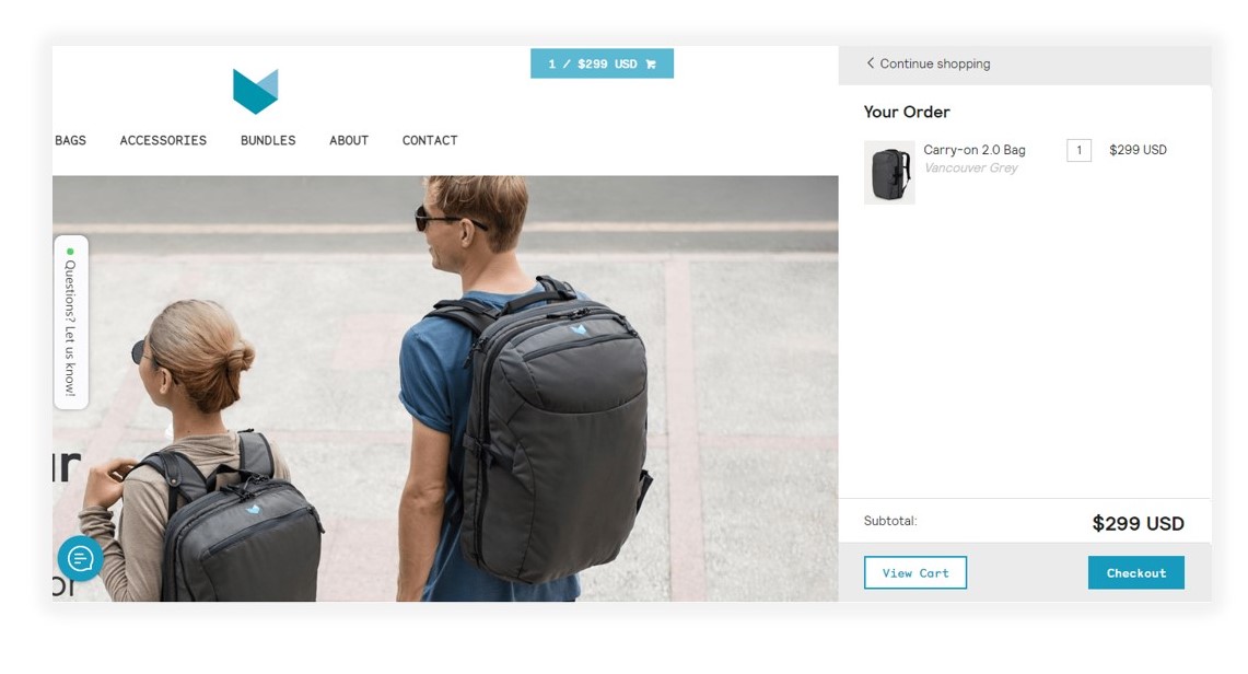
This online store sells backpacks and travel accessories to digital nomads. They used Kickstarter to raise $340,000 in 2013 and $700,000 in 2016. Their flagship product, the Carry-on 2.0 bag, was awarded “the perfect carry-on backpack” by BuzzFeed.
Their shopping cart shows up in the upper-right corner of the page. It displays the quantity and subtotal of cart items. Clicking the cart reveals a mini-cart popup instead of taking you to the shopping cart page,
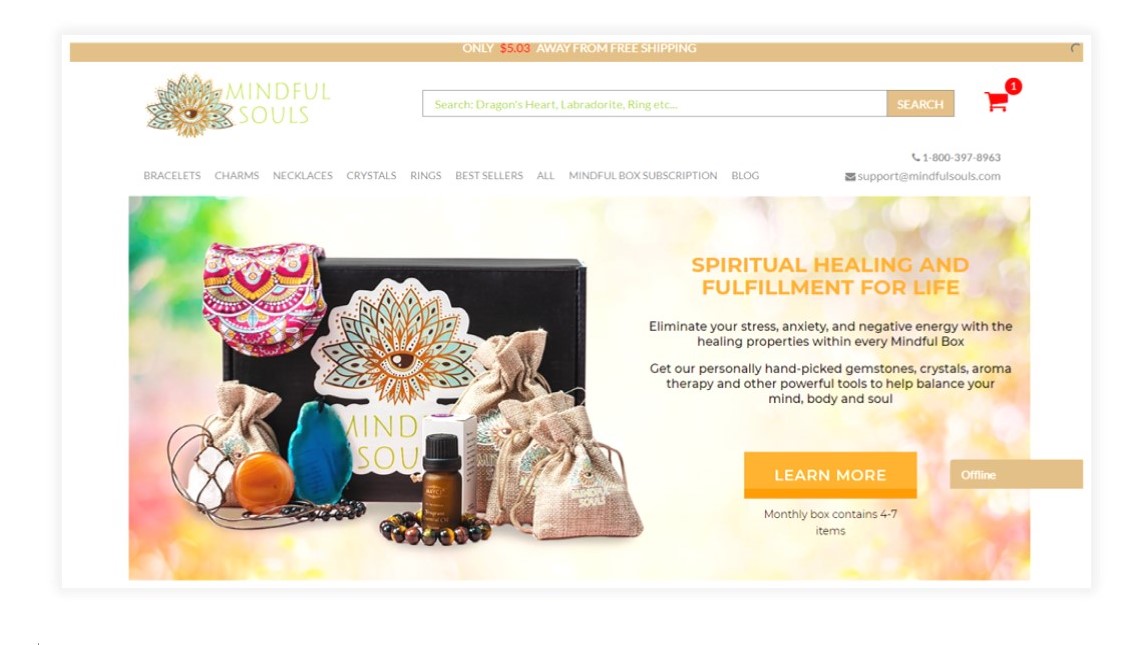
They sell clothes and jewelry to people engaged in spiritual practices. Their products are designed to eliminate stress, anxiety, and negative energy.
What about their shopping cart?.
The icon is placed in the upper right corner of the page and it shows the number of items. If your cart is empty, you’ll see a zero next to the shopping cart icon. When the cart is empty, its icon is gray, but as soon as you add something to your cart, the icon turns red and displays the number of items in your cart:
There are also the following features:
- A reminder that you are only $5.03 away from free shipping, encouraging you to add items to qualify
- A timer counting down how long your order is reserved, which encourages me to complete my purchase now
- “Real Reviews From Real Customers” for additional social proof
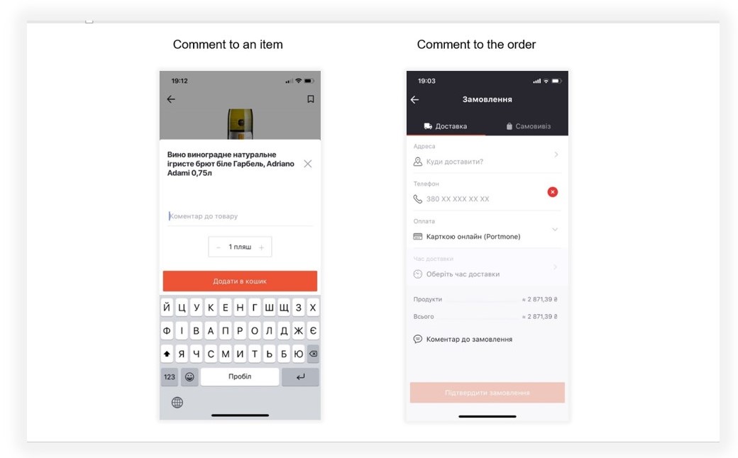
Goodwine – mobile app shopping cart – a collaboration between IWIS and Wine Bureau
Customers’ feedback «You’re the best!!! At everything!!! As always!!! :)» – it’s exactly the kind of recognition and appreciation, any brand is striving for. This feedback proves we are in tune with the customer.
So. what are our killer features?
- That’s a given, we’ve created Good Wine (iOS, Android) shopping cart usability, implementing best practices, mentioned before. Yet! We have crowned it all with some unique details that improve the experience of Good Wine customers.
- The user may leave a comment either to one item or to the order to provide more details, allowing the Good Wine staff to pay more attention and surpass customer’s expectations.
This is the way the company’s demonstrating its Human to Human personalized approach. Is it paying off? The answer to that is a definite YES! Just refer to the statistics mentioned above.
- Order the item out of stock. That’s another feature allowing users to order the item which is currently unavailable, or it’s got out of stock during the shopping process.
This way, the Good Wine employee seeing an item that is not available now, can select and offer a similar one to the customer. Otherwise, the customer will get notified when this item appears again. Goods are replenished fast – within 1-2 days, so the customer is fine about inconveniences.
- We are not going to dwell on this – we are planning to add the ability to make one order for several users logged in multiple devices with one account. This would be helpful for families and groups to collect the items simultaneously.
We have plenty of ideas thanks to customers’ feedback: sometimes it’s gratitude, sometimes it’s criticism, but more often we get good ideas.
Customers are refining their online shopping experience, so it’s vital for brands with development teams to continue bringing into life the best user experience practices to enjoy the “favorites” category.
* Retail Trends Report 2019, Microsoft